Website design: why is it so important?
Wednesday, 22 September 2021In the age of the internet, you search for every piece of information and make decisions depending on the information you are able to find online. Remember what you do first when you want to buy or order some products or services as a customer. You probably do some research on the internet, trying to find the best offers, solutions, and companies. And we suppose there’s no point in talking about the importance of a website. But we can’t underestimate the importance of website design. A bitter pill is that it’s better not to have a website at all than to kill impressions and sales with awful website design.
So why is web design so vital nowadays? Continue reading, as we are going to explain not only the reasons but also tell you what you need to do and how your website design should look like.
Why is website design so important?
More than half of the owners of small and medium-sized businesses invest in a new website or improve their current one to keep up with trends and outpace competitors. It’s worth spending on excellent web design because it can do great work for your business.
1. Creates the first impression
When you meet a new person, it takes only seven seconds to make an opinion about that person. And that opinion is usually based on appearance. The same refers to your website: visitors make their first opinion depending on the design of your website. But in the case of your website, you don’t have seven seconds.
- It just takes 0.05 seconds for a visitor to make an impression about your website design. (Source)
So imagine how quickly you should catch visitors’ attention! It’s a real challenge.
- 75% of users judge a business’s credibility mainly based on its visual design. (Source)
There’s no way to get around without incredible and unique website design.
Surprisingly, web design is essential even for the spheres where not the appearance but professionalism is the priority.
- For example, 94% of users’ first impressions of healthcare websites were design-related (Source)
2․ Builds trust and reliability
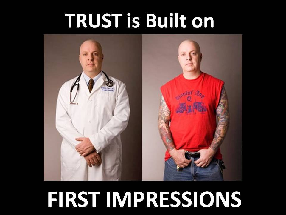
Lack of trust is a breaker not only in real relationships but also in the online interaction between you and your customers. Consumers purchase from the companies they trust and are well aware of. As the website’s main aim is to turn visitors into consumers, you should make your visitors trust you. Trust is the only way to transform people into consumers and website visits into conversions.
Unless you are a famous company and every visitor recognizes you, use web design to build and raise brand awareness. How?
Quickest tips:
- Include detailed and visible “About us” section, portfolio, privacy policy to your website as social proof to build trust.
- Keep web design consistent by using the same colors, typefaces, styles, and tone of voice.
- Make visitors remember your company, recognize it so that they can rely on it.
3. Operation and usability
Ease of use is one of the most important features of your website. Visitors come to your website with a certain intention already in their minds, so help them get the information they need.
Let’s speak with some facts.
- 44% of internet users will leave a website if the homepage doesn’t contain the contact details of a company.
Through well-design, you guide customers’ attention where you want: using the right colors, sizes, and whitespace, you can take your visitors by hand to the page you want.
- 48% of users think if the company doesn’t have a mobile-optimized website, it doesn’t care about them.
- 60% of users don’t come back to a website if the design isn’t responsive.
Stand out from your competitors. Be the one that cares not about the company’s profit but customers and their needs.
4. Navigation
There is a three-click rule to remember while designing a website. According to that rule, your visitors should never be more than three clicks away from what they are looking for. Reduce the amount of time required for users to get to the destination. Design your navigation so that visitors can reach where they want with the minimum number of steps.
The same refers to the number of options on the website. By reducing the number of options, the payment process becomes handier for customers. It’s easier for the customers to reach the end of the process and not abandon the cart.
- Around 61% of users will not return to a website that’s hard to navigate.
If your menus offered visitors direct access to every link on your site, you risk overwhelming them. Imagine Amazon’s menus providing you direct access to every link within your site. How many hours could it take to scroll through a menu! If you don’t want to test your visitors’ “stress resistance,” your designers should take care of simplifying navigation and grouping items into categories.
5. SEO
Did you know that good web design can boost SEO ranking, and vice versa: bad web design can badly hurt your ranking? If your website design doesn’t satisfy visitors, they are likely to leave and kill your ranking. Search engines will regard your website as uninteresting when they pick up that visitors are escaping from your website.
The high-quality design makes visitors stay longer on your website, and that’s great both for your conversions and for your website.
6․ Website load speed
- Websites loading in over 2 seconds are abandoned by 47% of visitors.
Good web design will make your website load quickly on all kinds of devices, from tablets and smartphones to desktops. Due to responsive visual media, your page will load in a matter of seconds. The visitors enjoy staying longer on the website that loads faster.
- Around 39% of users won’t engage with a website if the images don’t load quickly.
7․ Conversion
- Around 38% of website visitors won’t engage with unattractive web design.
But what was your main aim when you decided to have a website? For sure, one of them was boosting sales! Clear and visible Call to Actions (CTA) buttons, product catalogs with categories, and product pages where you can easily add the items you want to the cart will lead to more conversions.
How to make an incredible website design?
Crating a professional website design is complex work. A great web design a result of teamwork and combines a bunch of actions you can’t underestimate.
- Analyze
Before starting any web project, you should conduct an analysis and find out your goals, who your potential visitors are, what needs they have. Each market and field has its unique needs requirements.
- Plan
Summing up the information you have gathered during analyzing, determine what resources you will need. Depending on requirements project’s budget may vary.
- Design
Only after having the plan in your hands, you can pass to the design stage. Designing layouts, mock-ups, and other design elements is a process to enjoy.
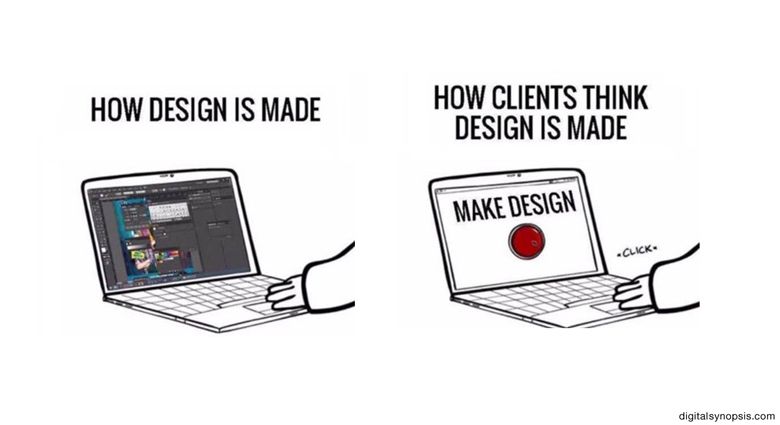
- Content
Don’t speak only about yourself. It’s much more important to show that you are interested in your customers and their comfort. Help them easily get the information they’ve been searching for.
Answer the questions they may be most interested in and structure the content in the most convenient way so it will be easy for your visitors to find and get it.
What’s your business about? Introduce your business on the landing page. If you have plenty of information to share, you can split the information over several pages.
Remember to keep your content simple, clear, and well-formatted.
- Visuals
Images help to draw the visitors’ attention to the options you want to emphasize. Well-placed images speak louder than words. Images catch visitors’ attention before the main text. Before visitors start reading texts, they pay attention to the image. If your website isn’t an art gallery, keep it simple not to confuse your customers.
Also, keep in your mind that the right balance between images and content on the website should be combined based on the target audience.
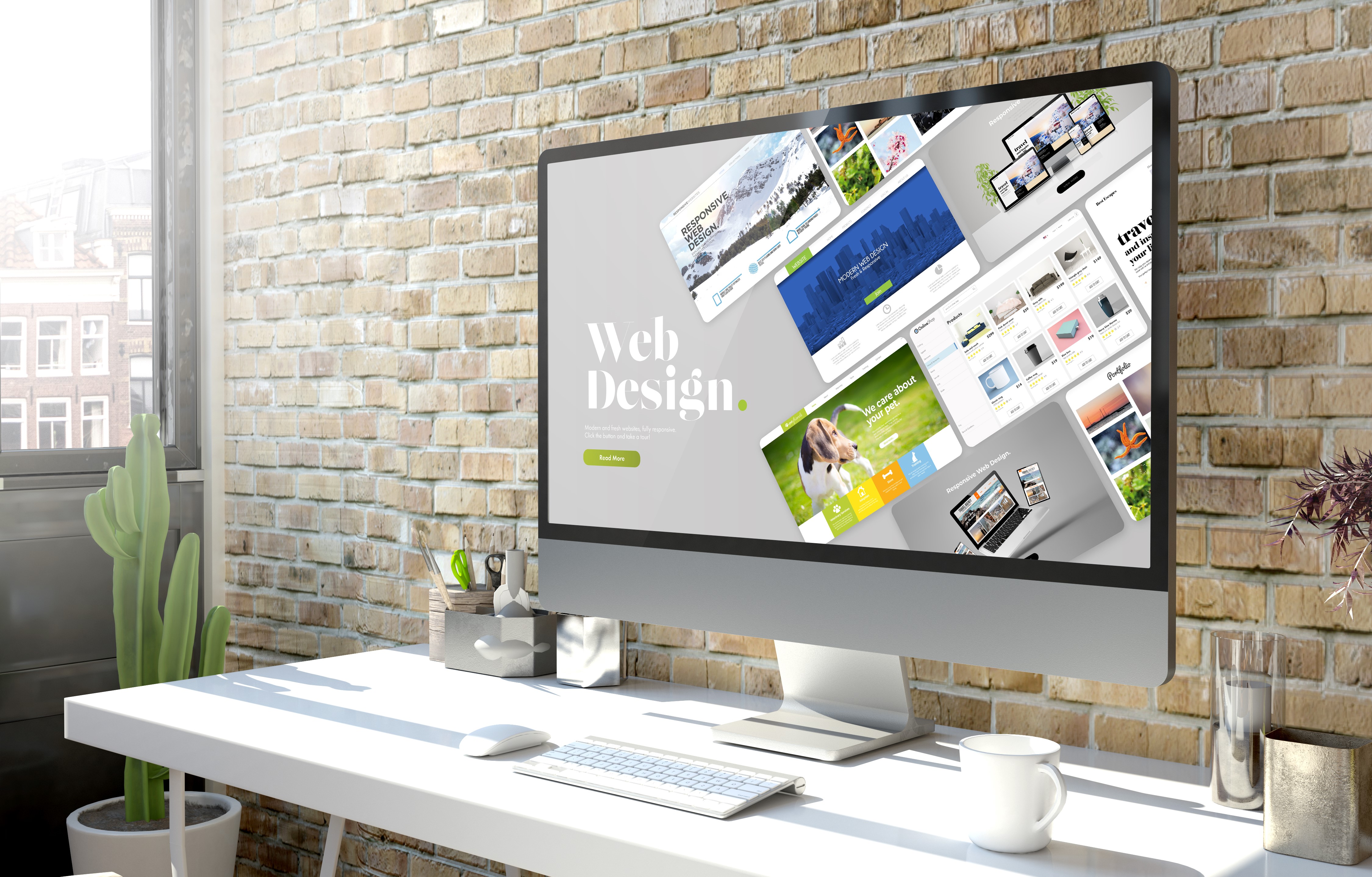
What should your website design include?
Let’s get acquainted with the most significant points to be taken into account when dealing with the design of your website.
- Simple navigation
- Responsive design
- Unique style
- Sensible content
- Quick load speed
Conclusion
If your website has slow load time, hard-to-read texts, or outdated web design, you’re making it harder for visitors to engage with your site. On the contrary, high-quality web design brings you human users and helps search engines rank your website.
Manvelyan Enterprises is one of the best web development companies. We create responsive web applications and websites that meet your business needs.
As a provider of web development services, we are experienced in navigating the development life cycle: quality, relevant time to market, and optimized resources. If you are interested or have any questions feel free to contact us